Ranked: The 12 Scottish Premiership home kits - from worst to best
By Joel Sked
Published 26th Jul 2019, 14:37 GMT
Updated 26th Jul 2019, 15:37 GMT
We are a week away from the start of the season so we should start talking about the important things: how nice are the home kits of each Scottish Premiership club.
Each of the 12 teams' home effort has been analysed and after much deliberation the final list has been decided. Click and SCROLL through, starting with the Premiership's worst kit.
.
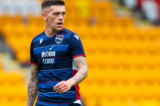
Fair play to the Staggies for always going for something a wee bit different. But this edition is too light and has FIVE colours. Too far, County. Too far.
St Mirren have had a real mix of kits recently. It would have been interesting to see the other ideas before it was decided to stick a massive H or upside down rugby goals on a white canvas. Maybe the H stands for 'Hurry up and sign players.'
The new home kit didn't go down too well with hands, and understandably so. The Hoops should but don't go all the way round, there is too much white space at the top and the collar? Nope.
Very, very similar to the 17-18 edition. No surprises, no risk. They do win some points for what looks like a cap design when looking from the front. Who will be the superhero to sa... let's move on.
Celebrating their 150th anniversary with the same colour of their first kit and the cheques are a nod to the 1997 Cup winning side. It looks like a training top purchased from a catalogue but it is different from the Killie norm and doesn't assault the eyes.