


The brand new Scottish Premiership is campaign is now weeks away and, like kids at Christmas, Scottish football fans are counting down the hours until the big day arrives in early August.
The competitive season has already started for some, with the Premier Sports Cup beginning at the weekend, while others have kicked-off their pre-season campaign over the last week. Set to begin on August 2nd, the 2025/26 Scottish Premiership season will see supporters across the country donning their club’s brand new home kits - but which club has released the best design this year?
With brand new designs from Macron, Umbro, Adidas and Joma, we have put together our list of the best - and the worst - Scottish Premiership home kits for 2025/26, from 12 to 1.
Scroll down and click through to see where your team’s home kit placed. Do you agree with our picks?

5. 8th: Celtic
In fairness to Adidas, there's not much you can do with a Celtic home shirt outside of green and white hoops (let's forgot the cabbage looking one from a few years ago), but this is a bit bland. They've smashed it out of the park with the away kits, but the tartan design intertwined doesn't add much to the actual design, and just overcomplicates it.. The three stripes on the shoulder should have been a different colour - the black feels out of place? It's okay, but it isn't spectacular. | SNS Group
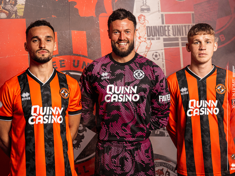
6. 7th: Dundee United
I have nothing positive nor negative to say about this. It's just an orange and black striped kit with a v-neck. Must have taken about 10 minutes to design. Does the job, but isn't a classic by any stretch of the imagination. The long sleeve looks a little bit like pyjamas. | Dundee United FC
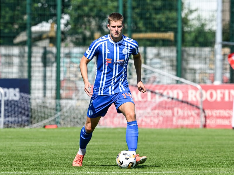
7. 6th: Kilmarnock
Do we like this, or do we hate this? It's hard to decide. The vertical stripes and the royal blue are really smart, but that shoulder design is a bit too much, isn't it? Also, why is the shirt such a complex design, yet the shorts and socks are so basic? It looks like they lost patience with the design. Last year's was so much better, and this just doesn't compare to it really. | SNS Group
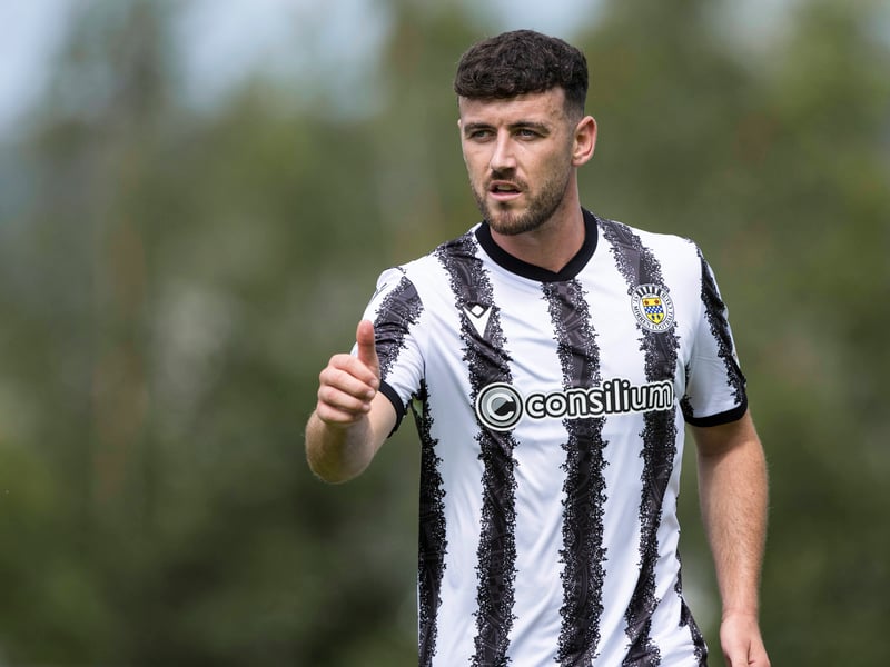
8. 5th: St Mirren
The wobbling black stripes create an optical illusion of sorts, which we weirdly like. The sponsor fits in with the design well enough, and it's just a bit different to St Mirren usual home kit. It's bold and brave, and I think bravery should be rewarded. Another top six finish for the men from Paisley. | SNS Group Photo: SNS Group